The New Face of Fenomen C
How do you refresh one of the most recognizable skincare lines without losing its identity? The packaging redesign for Perfecta's Fenomen C line was our answer to this challenge.
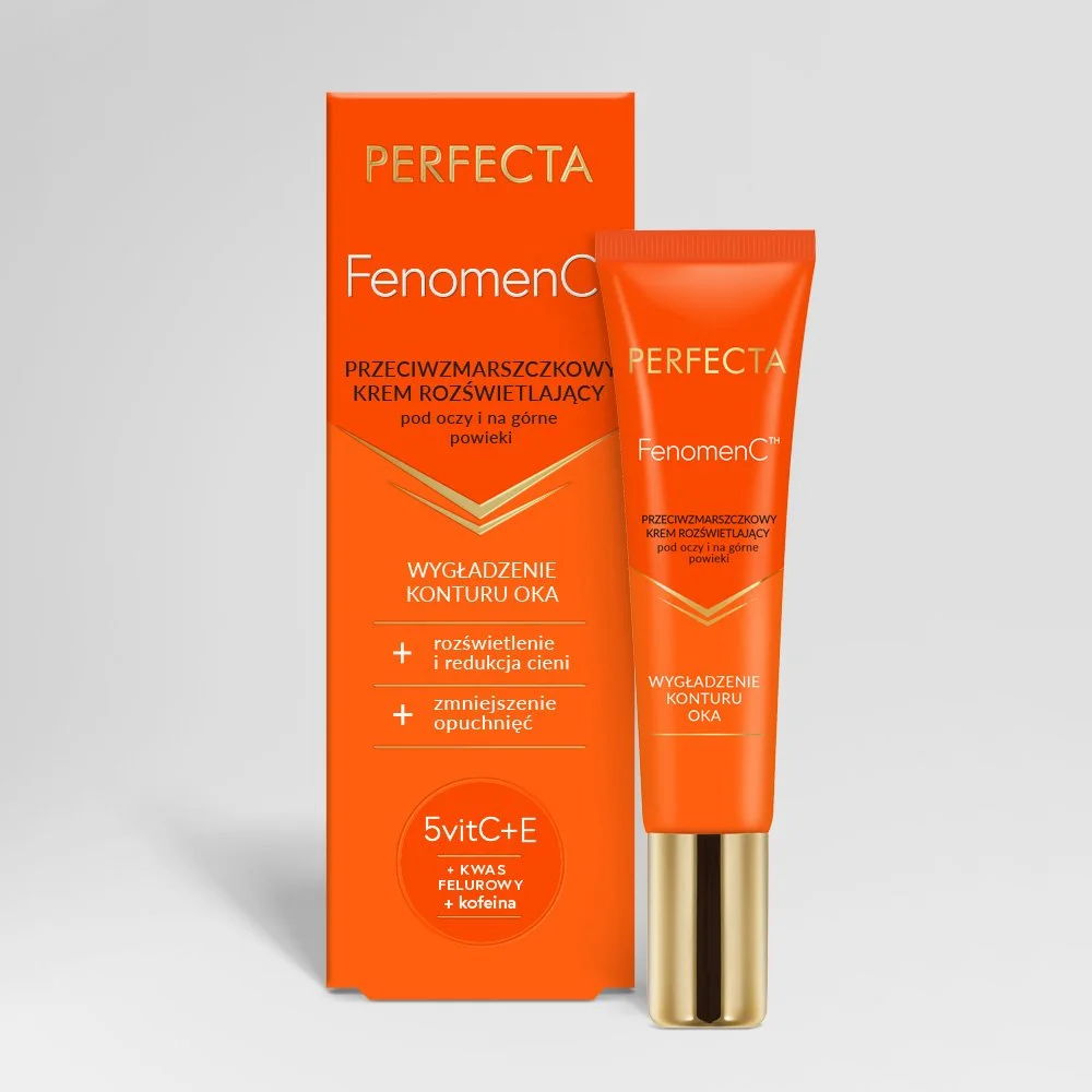
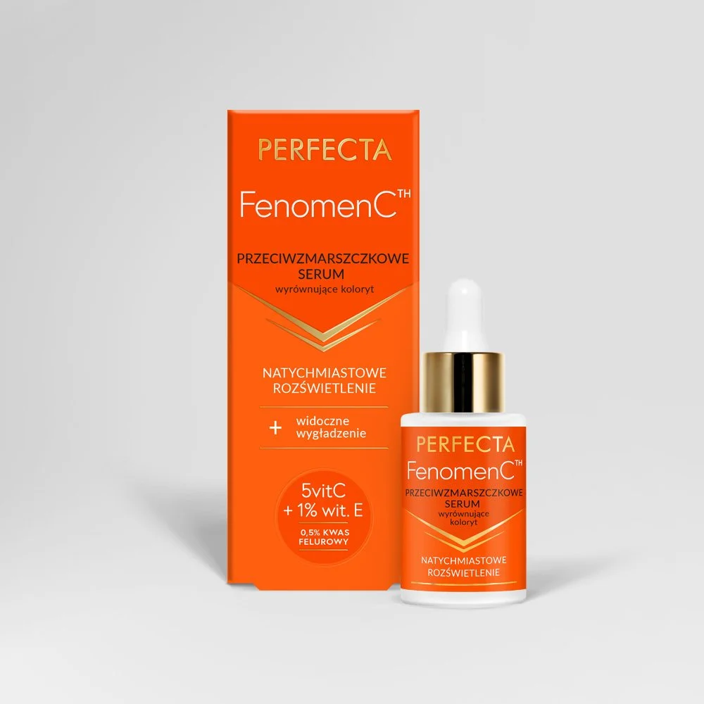
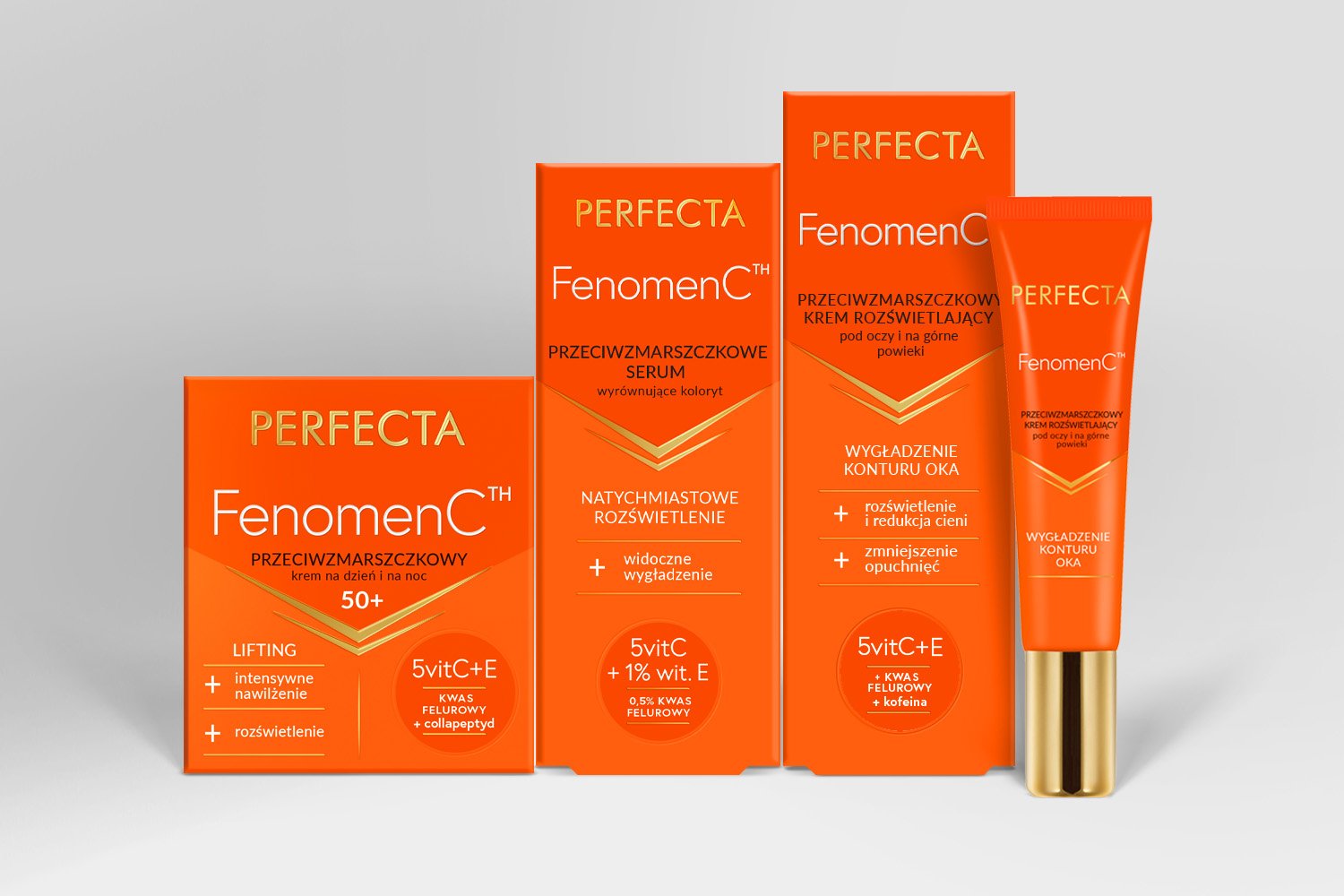
Our goal was to create a modern packaging system that would preserve the brand's distinctive visual identity while meeting the expectations of today's consumers. We retained the signature orange color palette, giving it a brighter, more vibrant tone, and refined the gold accents to create a more elegant and contemporary look.
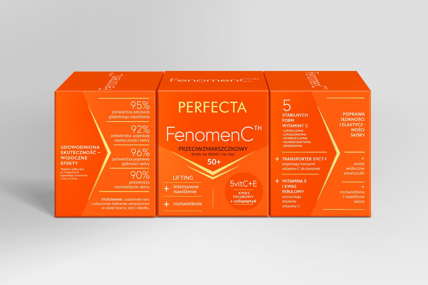
A key focus of the project was reorganizing the brand architecture. The front of the packaging was simplified and redesigned with a clear visual hierarchy, making the most important information easier to find at a glance. Secondary content was moved to the side panels, resulting in a cleaner, more minimalist design.
The outcome is a redesign that not only modernizes the visual identity of the Fenomen C range but also improves communication clarity and enhances the products' perceived value. We hope the refreshed packaging will not only delight existing customers but also attract a new generation of consumers.