EXCELLENT FRUIT TASTE
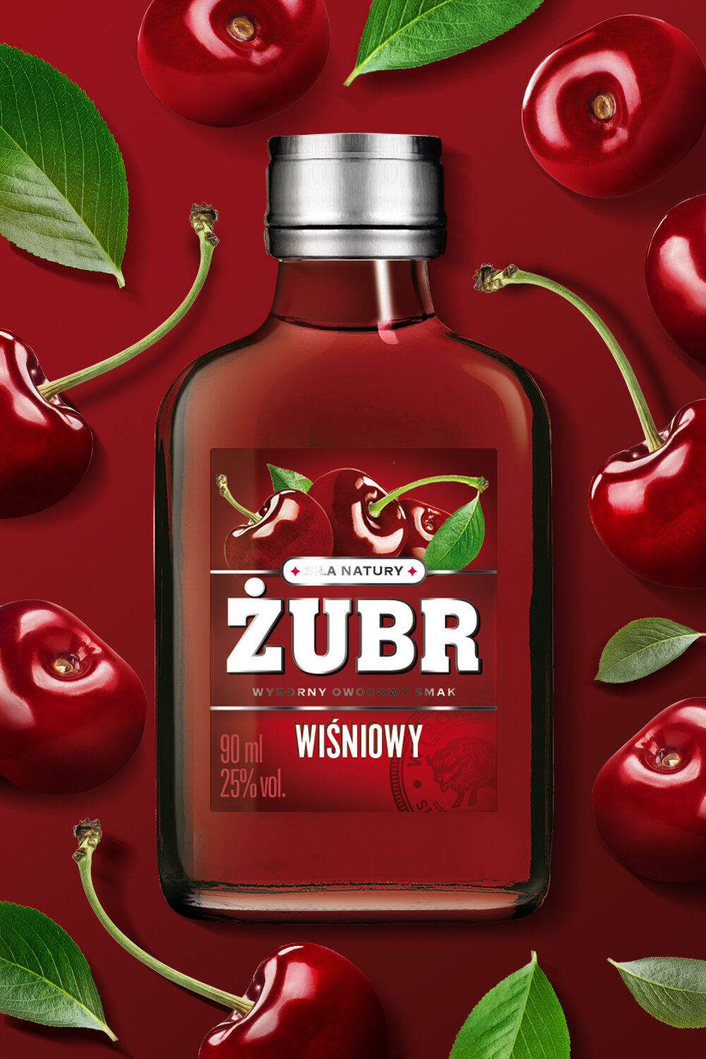
The recent growth of consumer interest in small formats bottles prompted Stock Polska to refresh the graphic packaging design of Żubr flavored liqueurs. The main purpose of the change was to emphasize the fruity taste of the product and increase the perception of "deliciousness."
We achieved this by changing the label architecture as well as enhancing the color intensity. After the re-design of the label the logo is the central element while the fruit composition is placed above. We decided not to use the color usually associates with pure vodka, blue, and instead replaced it with the color coding for a given flavor variant.
An additional element that emphasizes quality is the subtle watermark - a seal that also appears with pure vodka.